Hazard Exposure Assessment Dashboard
A personal workflow tool to speed up and standardize hazard exposure assessments for geographically distributed asset portfolios. This case study is independent and uses only public-domain, synthetic, or sanitized examples.
Highlights
What this dashboard is designed to achieve and how it's structured.
Objective
- Reduce manual steps when assessing tens to hundreds of sites.
- Produce decision-ready outputs: exposure metrics and clean visuals.
- Improve consistency using a repeatable, standardized workflow.
Approach
- Ingest asset locations and selected hazard layers.
- Automate overlays and summarization into exposure indicators.
- Generate maps and charts for interpretation and reporting.
Tools
- Streamlit for the interface and modular workflow steps.
- GIS overlays and spatial joins for exposure extraction.
- Python for preprocessing, automation, and batch processing.
My Role
- Designed the end-to-end workflow and information architecture.
- Defined exposure metrics and standardized output formats.
- Built as a personal optimization initiative, not a client delivery.
Key Takeaways
- Faster, more scalable assessments for distributed portfolios.
- Standardized outputs reduce rework and improve cross-project consistency.
- Clear visuals help communicate results to non-technical stakeholders.
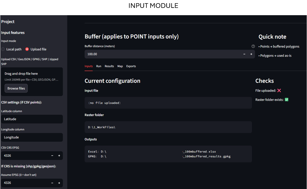
Inputs
Set up the assessment by loading asset locations and selecting hazard layers and analysis parameters.
- Upload or define asset locations as points or a site list.
- Select hazards and configure analysis settings such as buffers and thresholds.
- Validate inputs upfront to reduce rework downstream.
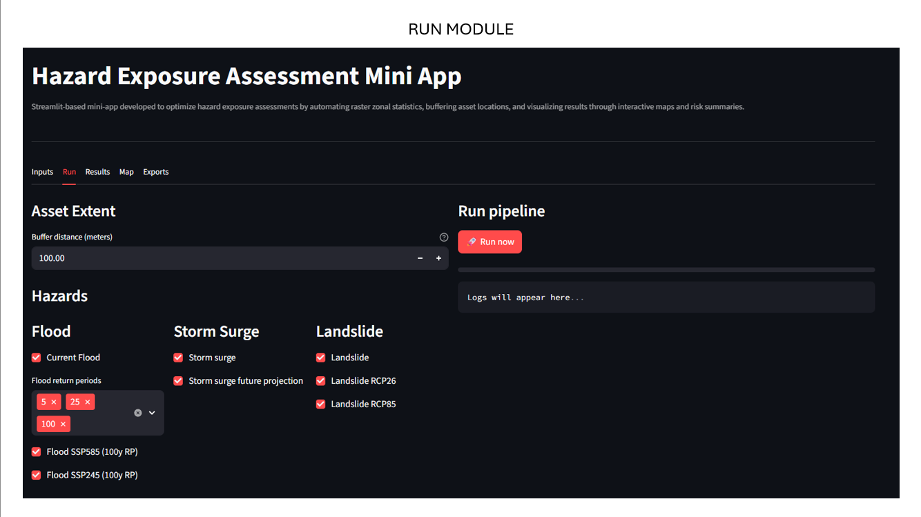
Run
Execute spatial overlays and summarization to compute exposure indicators consistently across entire portfolios.
- Automated spatial overlays and joins across selected hazard layers.
- Standardized aggregation into per-asset exposure metrics.
- Repeatable workflow scaling from tens to hundreds of sites.
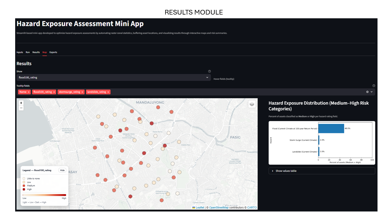
Results
Review decision-ready outputs — metrics and visuals — then export results for reporting packs.
- Portfolio-level summaries: counts and percentages by hazard class.
- Maps and charts to communicate spatial patterns clearly.
- Export tables and figures ready for client reporting.
Data Privacy Note
This case study is generalized and displays only public, synthetic, or sanitized examples. No client-confidential information is included.